Unbridled sign replacement
While we generally support Gov. Fletcher and his agenda for Kentucky, we don't agree with everything his administration has done. After all, no one's perfect.
Case in point is the proliferation of the Kentucky Unbridled Spirit "brand" for the state.
While we admit that the logo is eye-catching and it generally seems to be popular and successful, we weren't that crazy about it from the start. When the four choices for Kentucky's "brand" were presented to the voting public, three of them had horse-related themes, so it's a foregone conclusion that something with a horse was going to win. However, we believe that there's far more to Kentucky than horses.
The whole concept of a state "brand" is to create something enduring and endearing, like "Virginia Is for Lovers" or "Wild, Wonderful West Virginia" or "Famous Potatoes." And after the omnipresence of the absolutely hideous "Education Pays" signs and logos that sprouted everywhere during the Patton administration, Kentucky needed something new to put on letterhead and state welcome signs.
In general, Unbridled Spirit has caught on across the state. Local governments have put the logo on their publications and their water towers. The Ashland refinery at the eastern entrance to the state has the logo prominently displayed to greet visitors. It gets high marks for creativity and recognizeability.
But the state has taken it a bit too far.
If you've driven on one of Kentucky's parkways lately, you've probably seen new signage with the Unbridled Spirit logo at the bottom. These signs have replaced other text-based signs, many of which were recently redesigned to reflect the new monikers for these highways because Paul Patton went on an executive order spree and renamed most of them after Democrat governors. The Louie B. Nunn Cumberland Parkway is a notable exception; not to mention the whole Hal Rogers Parkway fiasco. What's next; renaming the Audubon Parkway for Happy Chandler, a native of the area?
At any rate, the new Unbridled Spirit signs aren't that drastic of a change from what was previously erected. But there's one notable exception -- the Bert T. Combs Mountain Parkway.
The Mountain Parkway is Kentucky's second-oldest former toll road and the oldest one not incorporated into the interstate system (the Kentucky Turnpike, which ran from Louisville to Elizabethtown, became part of I-65). It was also the first toll road named after a former governor, Bert Combs, in whose administration the road was conceived and built.
Its classic, distinctive signage, lets you know know beyond a shadow of a doubt what road you are on. The "path beside a tree" is genius in its simplicity, elegant in its understatement, and a perfect graphic logo of a road leading into the mountains.
In case you've never seen the signage, a photo is below:

If you've never seen one of these beauties in person, you'd better get to eastern Kentucky fast because those signs are rapidly disappearing, to be replaced with the new-style sign show below:
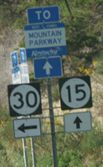
The new sign has none of the artistic uniqueness of the old one. The color schemes and patterns for the new signs for all nine former toll roads are the same. A Wendell H. Ford Western Kentucky Parkway sign will look the same as an Edward T. Breathitt Pennyrile Parkway sign, instead of the WK Parkway sign being blue and white and the Pennyrile Parkway sign being green and white. And nothing about that new sign denotes the one-of-a-kind importance of the Mountain Parkway, which opened up a forlorn and forgotten area of the Bluegrass State to economic development, tourism, and access to education, employment and health care opportunities.
If the Transportation Cabinet was dead-set on posting the Unbridled Spirit logo on the parkway system, it could have erected stand-alone Unbridled Spirit logo panels below the existing signs, in the same manner that they originally added the politicians' names to the signage. However, it's a foregone conclusion that the next Democratic governor will probably remove all traces of Unbridled Spirit out of spite, and perhaps they viewed this change as making it harder for Fletcher's successors to obliterate the successful brand. It'd be far easier to remove individual panels than it will be to change all the signage, particularly after it's just been changed to add the logo.
What the state really should have done was to give the state's route markers a makeover. The bland "circle or oval in a black box" design is used by several other states, such as New Jersey, Delaware, Mississippi and Iowa. Maybe the state could have come up with a new state numerical marker design that used the brand, and left the parkway signage alone. Oklahoma, which previously used the same style of state route marker as Kentucky, recently redesigned its signs to incorporate a silhouette of the state's outline. If you see one of those signs, you know you're in Oklahoma.
At any rate, we lament the passing of the old, distinctive Mountain Parkway signs. They were truly unique and no doubt a comfortable, familiar sight to those who moved from the area but come home from time to time. That's one place where the unbridled spread of Kentucky's new brand needed to be reined in.
(We should note that these images shown above were lifted from another site and used with permission of the photographer).
posted by K-Pac II @ 7:54 PM
1 comments
![]()
![]()

1 Comments:
Pachyderm:
I read your blog because we disagree politically. On this post, we are in aboslute agreement. I could go on and on about signage - good and bad- it is a pet peeve of mine - but I won't.
But, we do agree here.
Jeff Noble
Louisville, Kentucky
Post a Comment
<< Home